

Organising the Content
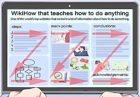
Place an interesting title at the top of your poster. Aim for the title to span the entire width of your poster, as this makes it easy to read. Create a title that will draw people toward your poster to find out more about your topic. Consider defining the scope of the research, asking a rhetorical question, or hinting at a surprising or interesting finding. For example, “New Poetry Discovered in the Journals of WW2 Soldiers” would be an interesting title for a poetry poster.
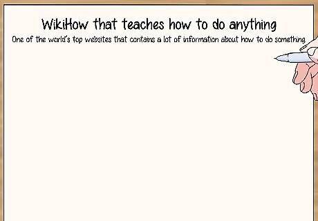
Start with an introduction in the top left corner of the poster. Underneath the title, state what your poster is about and the impact your findings could have in the real world. Include your reasons for researching the topic and mention any related model studies. If you're making a scientific poster, include your hypothesis in the introduction. This section is generally only 1 paragraph long.
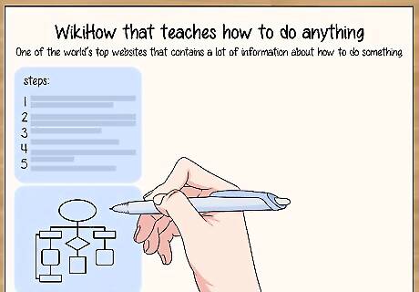
Detail your research methods next. Use steps or a flowchart to describe how, when, and where your research was conducted. This gives your research validity. Place this section next to the introduction, such as in the top right corner. For example, if you collected water samples for a geography project, explain where you got the water from, when you collected it, and the method that you used to take the sample. If your poster is summarising the work of artists or researchers, such as in poetry, geography, or history, explain why you chose the publications that you used and detail the modes of research you utilised. If you are making a scientific poster, include all the materials that you used, your method of statistics, and why you chose the method that you used. Use sub-headings, such as “Materials” or “Steps” to break up the section.
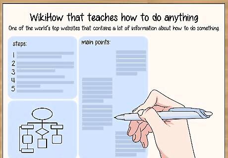
Use the centre of the poster to display your results or main points. This information should make up the bulk of your poster. Place this section in the middle of your poster to help it stand out. When you write your main points, consider who your audience is and think about what information they would be interested in. For example, if you are making a poster for a children's poetry fair, lots of funny poems and poetry facts would likely draw the children to your poster. If you are making a scientific poster, use annotated graphs and tables to visually display the data that you have collected. If you’re making a history or geography poster, consider placing an essay, timeline, or map in this space.
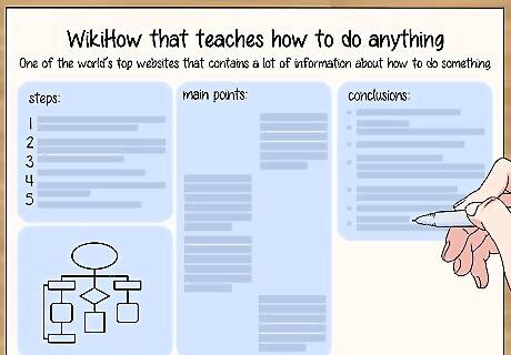
Write a short conclusion to summarise your findings. Summarise your results in bullet points or a few sentences to outline the key findings. Consider bolding your key conclusions to make them stand out. Place this information at the bottom of your poster. Contemplate ending with a memorable quote. For example, if you are making a history poster, you could find a profound Nelson Mandela quote to finish with. If you are making a scientific poster, compare your results to the hypothesis and comment on whether your predictions were correct.
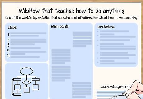
Include references and acknowledgments in the bottom right corner. If you used any references in your poster, include the full citations in this section. Finish the section by acknowledging anyone that helped you with the project, such as mentor, sponsors, or tutors. This section can have a smaller font than the rest of the poster if you have limited space.
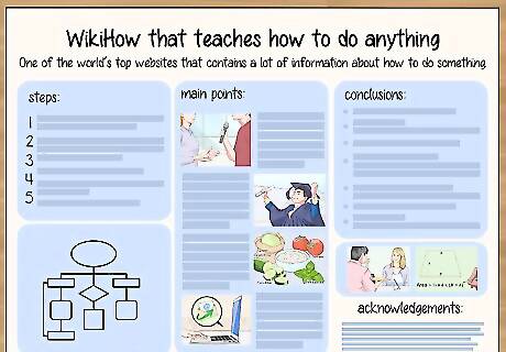
Add visuals to make your poster stand out. Visuals help to break up large sections of text in your poster and make it easier and more interesting to read. Where relevant, include photos, graphs, and charts. Place images next to or below the text that it relates to. Use high-resolution photos to ensure that the images don’t look fuzzy when they are printed. Avoid using Clip Art, as this tends to look unprofessional.
Formatting the Poster
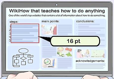
Use at least 16 pt font in your poster to make it easy to read. If the font on your presentation poster is too small, it will discourage prospective viewers from reading it. Highlight all of your body text and select the 16 pt font option. If you have enough room, increase the font size to 20 pt or 24 pt. The larger the text is – the easier it will be to read.
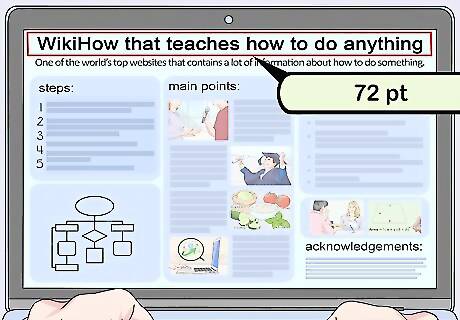
Make headings big so that they can be easily viewed from 10 ft (3 m) away. The title and headings are generally what draws people to your poster and will prompt them to read further. In order for the key text to be seen from a distance, write titles in at least 72 pt font and headings in 48 pt font. Stand 10 ft (3 m) away from your poster and check that the key titles can be read. If you have trouble reading them, increase the size of the text.
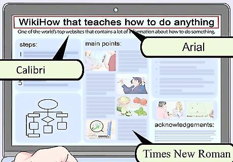
Use easily legible fonts. Avoid cursive or handwritten fonts, such as Brush Script and French Script, as these can be difficult to read. Opt for traditional academic fonts that are easy to read and widely used. Times New Roman, Helvetica, Calibri, Arial, and Garamond are good font options.
Choose 1 font for all of the body text in your poster. This makes the poster easier to read and helps it to look cohesive. Highlight all of the different sections of body font and change them to the same font. Bold any important words or phrases to help them stand out.
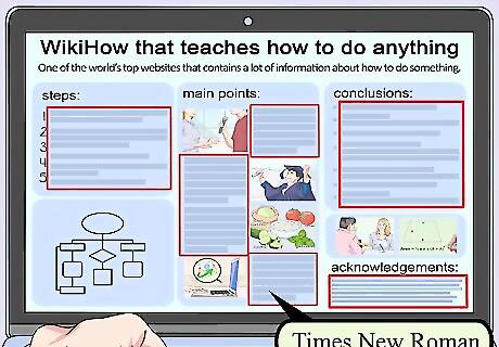
Space out visuals and text to create a balanced poster. If there are no gaps between the sections or paragraphs, the text will be difficult to read and the page will look cluttered. To define the different sections of the poster and make it appealing to the eye, leave at least 1 centimetre (0.39 in) of space above, below, and either side of each section and image. Use paragraphs to break up large sections of text. Gaps between sections are often referred to as white space.
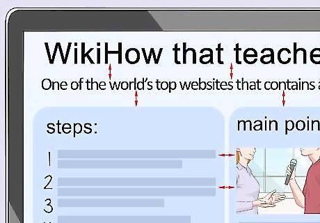
Follow the traditional reading layout of left to right and top to bottom. Readers will instinctually start looking for information at the top left corner, therefore, place the information that should be read first in this spot. Continue to add sections to the right of the first text. Once you reach the end of the top line, start the next section at the right side of the page. Once you have created a first draft of the poster, ask a friend if they can easily understand the flow of the poster. If they can't, rearrange the components until they fit in a natural, logical way.
Using PowerPoint
Use the Page Setup toolbar to set the size of your poster. It is important to format the correct sized slide before you start designing your poster; otherwise, the poster may not print to the correct proportions or dimensions. To change the size of the slide; click on the Design tab, tap on the Page Set up option, click on the Slides Sized For option, and then enter your desired page dimensions. If you haven’t been given a specified poster dimension, make the poster 48 inches (120 cm) wide and 36 inches (91 cm) tall.
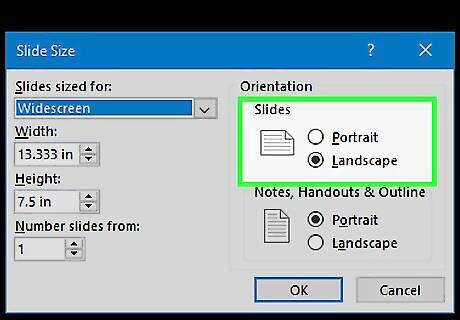
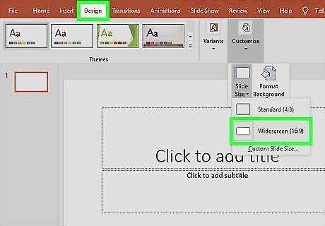
Select the correct page orientation in the Design toolbar. Most presentation posters use landscape orientation. This tends to be the default setting on most PowerPoint presentations; however, if you need to change the orientation, it is a quick and easy process. Click on the Design tab, press Customise, select Slide Size, click Custom Size, and then select portrait or landscape. If the slide is already in the correct orientation, skip this step.
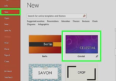
Utilize the poster templates in the PowerPoint templates toolbar. These templates are a useful starting point to help you format your poster. To access the templates, click File, select New, click From Template, and then chose the template that best suits your project. These templates can be edited in the same way as a regular PowerPoint presentation.
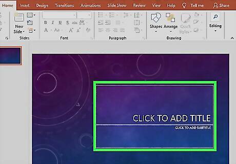
Click on the textbox icon in the main menu to add text to the poster. Click on the text box icon in the main toolbar ribbon. Once you have clicked on the icon, simply click where you want the text to be and start typing. The text box icon is a small square box with an “a” and horizontal lines inside it.
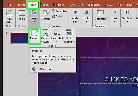
Use the Insert menu to add visuals to the poster. Click on the Insert menu, select Picture, and then tap Picture From File. This will bring up your photo gallery. Scroll through your photos to find the picture that you want to use and then press Insert. Opt for high-resolution photos to ensure that the photos look sharp and clear when you print the poster. You can also use graphs, charts, and other visuals in addition to photographs.
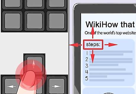
Use the arrow keys to move text and images around your poster. Click on the image or text box that you want to move and then use the arrow keys on the bottom right of your keyboard to rearrange the content. Alternatively, hold down the right mouse button and drag the content to your desired position. If you want to adjust the positioning of an object very slightly, hold down the Control (Ctrl) key as you use the arrows. This reduces the size of the movements.


Comments
0 comment