86
views
views
As soon as Apple lifted the veil of its much-eyed square-shaped Watch, its design was pit against the best-looking Android Wear Moto 360 smartwatch.
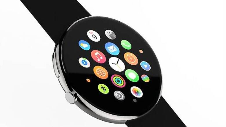
Design comparisons were inevitable as Apple unveiled to the world its first smartwatch on Tuesday. As soon as Apple lifted the veil of its much-eyed square-shaped Watch, its design was pit against the best-looking Android Wear Moto 360 smartwatch. And it didn't take UX and UI designer Alcion long to come up with his renderings of the Apple Watch with a circular display. Here are some posts from the Alcion Facebook page exhibiting how the Apple Watch with a circular display might have looked like.
####


Comments
0 comment