
New Delhi: Two of world’s biggest tech companies have fallen in love with the same thing, and they are not complaining.
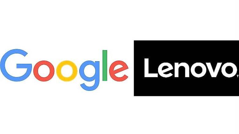
Google and Lenovo recently redesigned their official logos. While the computer maker moved from italicised to a straighter logo, the search giant redesigned its own with simplicity of schoolbook letter printing.
However, one thing common in both the logos is their slightly slanting ‘e’. The similarity is nothing more than a coincidence and could in fact prove in sync when the two companies decide to collaborate on future projects.
Also read: On a scale of 1 to 10, how would you rate the new Google logo?
The new Google logo retains the rotated 'e' from the previous Google logo, as a reminder that Google will "always be a bit unconventional."
On the other hand, Lenovo says, “The new logo offers a more personal experience.”


Comments
0 comment