179
views
views
The 2015 update of the Google logo is the biggest overhaul in Google's logo history.
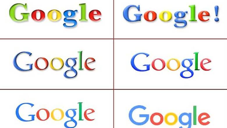
Google has refined its famous logo as it prepares to become a part of a new holding company called Alphabet. The new logo in a font called "Product Sans" is the sixth since the technology giant was founded 17 years ago in 1998 (seventh if we take in account the pre-launch 1997 variant).
The 2015 update of the Google logo is the biggest overhaul in Google's logo history.
Google had last tweaked its logo in 2013 when it did away with with the embossment and shadows. The change prior to that in 2010 had made the Google logo "lighter, brighter and simpler."
The second variant of the Google logo (1998-199) had an exclamation mark at the end, like its rival Yahoo!.
Here's a quick look at Google's logo history:


Comments
0 comment