views
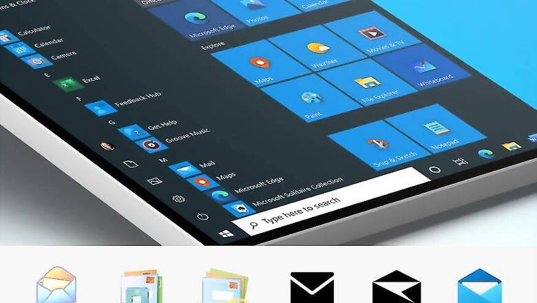
Microsoft says to design for Windows is to design for the world. That may just be it, considering Windows PCs are as common in the world as pretty much nothing else in the world of tech. Nevertheless, the company says that it is now working on redesigning the icons of all their products, by which they mean apps, and you should see these changes one by one in the coming months. In a way, this process did start when the Microsoft Office Icons were redone last year (they look much better now, to be honest), but let us just go with what the company is saying. New start. Okay.
“Many of these icons will be updated as app updates from the Microsoft Store. We are beginning to roll them out to Windows Insiders in the Fast ring first, starting today. The Mail and Calendar icons rolled out this morning to Release Preview. Over the coming months, Insiders will see more of the icons in Windows 10 get updated with new designs!” says Brandon LeBlanc, Senior Program Manager, Windows Insider Program while announcing the Windows 10 Insider Preview Build 19569. Over time, all app icons including Alarms & Clock, Calculator, Mail, and Calendar will be redone with a hopefully more modern touch. If the new Mail icon is anything to go by, that surely seems to be the case.
In a separate post on Medium, Microsoft says it understands that its users are working with multiple operating systems, constantly switching between tasks, priorities, and identities. That means there is a need for familiarity across all the devices they use, particularly for their most important apps. “The addition of color also gives a cohesive design language across platforms: the icon that’s familiar in Windows 10 is the same on Android, iOS, and Mac, providing a wayfinding path across your digital life. The new rounded corners across the Windows 10 interface achieve the same goal: making these icons feel like they live in the real world; something familiar and approachable to grab onto,” says Christina Koehn, Design Leader, Windows and Devices at Microsoft. This was perhaps needed. Microsoft hasn’t really touched or tweaked the Windows 10 core apps icons since the operating system debuted in 2015. Surely, 5 years is a long time in the world of technology, and it may be more about adding a bit of modernity to the entire package to keep up with the times. We can’t wait to see these new icons soon.


Comments
0 comment